Climate change in charts: from record global temperatures to science denial
The world’s hottest year on record has prompted much media coverage. But there haven’t been enough charts and graphs

The year 2015 was the hottest on the modern record. Photograph: Peter Macdiarmid/Getty Images
Much has been written about climate change in recent months, what with thatrecord-breaking hot year we just had and the qualified success of the Paris climate talks.
But if there’s one criticism I’d have of the media coverage, it’s this.
Not enough graphs.
So here are six that you might have missed, but that tell us a few things about the state of the climate and the state of the public’s thinking on global warming.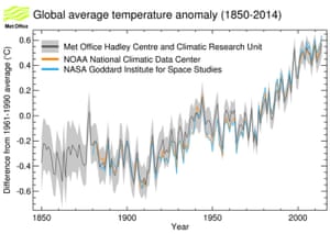
FacebookTwitterPinterest Chart showing average global temperatures from 1850 to 2015 according to three major datasets Photograph: Met Office, UK
So how have global temperatures been recently? You know, while human-caused global warming has been on that pause that didn’t happen.
The forecast is for continued global warming largely driven by continued high levels of greenhouse gases.MetOffice
Above is a chart from the UK’s MetOffice showing the three main global temperature data sets. These, for the hardcore among you, are known as HadCrut4 (MetOffice), GISTEMP (NASA) and MLOST (NOAA).
Pretty clear, right? All three show 2015 was the hottest year on record.
The chart shows “anomalies” (that’s the temperatures above or below a long-term average), in this case, against the average temperature between 1961 and 1990.
So for the MetOffice data, 2015 was 0.75C above the long-term average.
In December 2014, the MetOffice guessed (and when I say guess, I mean they used some powerful, skilful and sophisticated modelling) that 2015 would be between 0.52 and 0.76C above average. So they were right. Just.
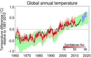 Chart showing the MetOffice estimate of global temperatures in the upcoming five years to 2020 Photograph: Met Office
And while we’re talking about forecasts from the MetOffice, here’s another one of theirs from a few days ago.
The MetOffice now makes “decadal” forecasts – that is, another of their guesses (same caveats apply as before with the term “guess”) on “near term” conditions globally over the next five years.
The black line shows actual temperature measurements. The red band are previous predictions and the green band shows the expected range according to climate models.
In short, according to the MetOffice, the forecast is “for continued global warming largely driven by continued high levels of greenhouse gases”.
Much has been written about climate change in recent months, what with thatrecord-breaking hot year we just had and the qualified success of the Paris climate talks.
But if there’s one criticism I’d have of the media coverage, it’s this.
Not enough graphs.
So here are six that you might have missed, but that tell us a few things about the state of the climate and the state of the public’s thinking on global warming.

FacebookTwitterPinterest Chart showing average global temperatures from 1850 to 2015 according to three major datasets Photograph: Met Office, UK
So how have global temperatures been recently? You know, while human-caused global warming has been on that pause that didn’t happen.
The forecast is for continued global warming largely driven by continued high levels of greenhouse gases.MetOffice
Above is a chart from the UK’s MetOffice showing the three main global temperature data sets. These, for the hardcore among you, are known as HadCrut4 (MetOffice), GISTEMP (NASA) and MLOST (NOAA).
Pretty clear, right? All three show 2015 was the hottest year on record.
The chart shows “anomalies” (that’s the temperatures above or below a long-term average), in this case, against the average temperature between 1961 and 1990.
So for the MetOffice data, 2015 was 0.75C above the long-term average.
In December 2014, the MetOffice guessed (and when I say guess, I mean they used some powerful, skilful and sophisticated modelling) that 2015 would be between 0.52 and 0.76C above average. So they were right. Just.
 Chart showing the MetOffice estimate of global temperatures in the upcoming five years to 2020 Photograph: Met Office
And while we’re talking about forecasts from the MetOffice, here’s another one of theirs from a few days ago.
The MetOffice now makes “decadal” forecasts – that is, another of their guesses (same caveats apply as before with the term “guess”) on “near term” conditions globally over the next five years.
The black line shows actual temperature measurements. The red band are previous predictions and the green band shows the expected range according to climate models.
In short, according to the MetOffice, the forecast is “for continued global warming largely driven by continued high levels of greenhouse gases”.

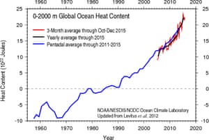
Chart showing the rising heat content of the world’s oceans Photograph: NOAA
You can’t really talk about global warming without talking about the oceans, given that this is where the vast majority of the extra heat and the extra carbon dioxide ends up.
The above chart, from the National Oceanic and Atmospheric Administration, shows the latest temperature readings from ships and from a network of almost 4,000 floats – known as the Argo array.
A study published a couple of weeks ago found heating of the oceans was accelerating, particularly in the deeper ocean.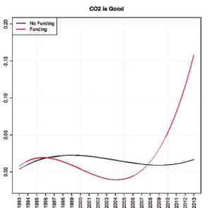
FacebookTwitterPinterest Chart showing how often thinktanks that oppose climate action argue that CO2 is good and how those funded by Exxon or the Koch brothers make that argument more often. Photograph: Proceedings of the National Academy of Sciences
One of the most popular talking points among climate science denialists is that CO2 is just great and the more of it that we pump out, the better things will be.
This goes against the advice of every science organisation of repute on the planet. But who needs science when rapper BoB can apparently just nudge us off the edge of the Earth?
Anyway, as I’ve written here before, there’s an industry that has grown up around climate science denial and its epicentre is the network of US-based “free market” conservative thinktanks.
The chart above is from a paper by Yale University’s Dr Justin Farrell in the journal Proceedings of the National Academy of Sciences published in October 2015.
Farrell examined the output of 164 thinktanks – mostly based in the US – that form a “climate counter-movement” by attacking science and working against policies to cut greenhouse gas emissions.
After writing a program to analyse some 39m words worth of reports, letters, blog posts and the like, Farrell found something interesting (actually, he found lots of interesting things).
As the chart above shows, thinktanks that had taken funding from either oil giant Exxon or groups linked to the oil billionaire Koch brothers were far more likely to say that “CO2 is good” than those that didn’t.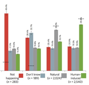
FacebookTwitterPinterest Chart showing the views of Australians on the causes of climate change. The dashed line shows each group’s opinion and the bars show how many people they think agree with them. Photograph: Nature Climate Change
While most people accept that climate change is happening, there continues to be a roughly even split among the public about its causes.
Some think it’s mostly natural, some think it’s mostly human-caused. This split is in no small way thanks to the misinformation campaigns run by the groups mentioned above.
In Australia the public is still split on the causes of global warming, according to a CSIRO survey of about 5,000 people.
But one fascinating aspect of a CSIRO survey on public attitudes to climate change isn’t what people think, but what people think other people think – if you follow me.
The chart above is taken from a 2013 study published in Nature Climate Changeand illustrates how fabulously crap most people are at gauging the climate opinions of others.
For example, 7% of Australians think climate change is “not happening” – as shown by the dotted line on that bar. But that group thinks that about half of Australians think the same. Wildly wrong.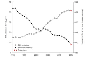
FacebookTwitterPinterest Chart showing global CO2 emissions from fossil-fuel use and industry since 1990 and emissions intensity CO2 /GDP. The red symbols are projections for 2015. Photograph: Nature Climate Change
Rising CO2 emissions and economic growth have been like two kids who met as childhood sweethearts and just never broke up. It has always seemed like the two were made for each other.
But if you want to keep an economy growing but tackle the critical issue of rising emissions, then there has to be a break-up. Decoupling economic growth from rising emissions is the big challenge.
This chart comes from a December 2015 paper, also in the journal Nature Climate Change.
The black squares show the amount of greenhouse gases being emitted for every unit of GDP. Clearly, that’s been dropping. The white circles are carbon dioxide emissions, and clearly they’ve been going up.
Success would mean both those lines heading rapidly south. The study showed that for the first time, emissions had dropped slightly while the world’s economy grew.
So is there a break-up on the cards?
Commenting on the finding, Myles Allen, professor of geosystem science at the University of Oxford said: “Is this the beginning of the end of global warming? Probably not. But let’s hope it is the end of the beginning.”
You can’t really talk about global warming without talking about the oceans, given that this is where the vast majority of the extra heat and the extra carbon dioxide ends up.
The above chart, from the National Oceanic and Atmospheric Administration, shows the latest temperature readings from ships and from a network of almost 4,000 floats – known as the Argo array.
A study published a couple of weeks ago found heating of the oceans was accelerating, particularly in the deeper ocean.

FacebookTwitterPinterest Chart showing how often thinktanks that oppose climate action argue that CO2 is good and how those funded by Exxon or the Koch brothers make that argument more often. Photograph: Proceedings of the National Academy of Sciences
One of the most popular talking points among climate science denialists is that CO2 is just great and the more of it that we pump out, the better things will be.
This goes against the advice of every science organisation of repute on the planet. But who needs science when rapper BoB can apparently just nudge us off the edge of the Earth?
Anyway, as I’ve written here before, there’s an industry that has grown up around climate science denial and its epicentre is the network of US-based “free market” conservative thinktanks.
The chart above is from a paper by Yale University’s Dr Justin Farrell in the journal Proceedings of the National Academy of Sciences published in October 2015.
Farrell examined the output of 164 thinktanks – mostly based in the US – that form a “climate counter-movement” by attacking science and working against policies to cut greenhouse gas emissions.
After writing a program to analyse some 39m words worth of reports, letters, blog posts and the like, Farrell found something interesting (actually, he found lots of interesting things).
As the chart above shows, thinktanks that had taken funding from either oil giant Exxon or groups linked to the oil billionaire Koch brothers were far more likely to say that “CO2 is good” than those that didn’t.

FacebookTwitterPinterest Chart showing the views of Australians on the causes of climate change. The dashed line shows each group’s opinion and the bars show how many people they think agree with them. Photograph: Nature Climate Change
While most people accept that climate change is happening, there continues to be a roughly even split among the public about its causes.
Some think it’s mostly natural, some think it’s mostly human-caused. This split is in no small way thanks to the misinformation campaigns run by the groups mentioned above.
In Australia the public is still split on the causes of global warming, according to a CSIRO survey of about 5,000 people.
But one fascinating aspect of a CSIRO survey on public attitudes to climate change isn’t what people think, but what people think other people think – if you follow me.
The chart above is taken from a 2013 study published in Nature Climate Changeand illustrates how fabulously crap most people are at gauging the climate opinions of others.
For example, 7% of Australians think climate change is “not happening” – as shown by the dotted line on that bar. But that group thinks that about half of Australians think the same. Wildly wrong.

FacebookTwitterPinterest Chart showing global CO2 emissions from fossil-fuel use and industry since 1990 and emissions intensity CO2 /GDP. The red symbols are projections for 2015. Photograph: Nature Climate Change
Rising CO2 emissions and economic growth have been like two kids who met as childhood sweethearts and just never broke up. It has always seemed like the two were made for each other.
But if you want to keep an economy growing but tackle the critical issue of rising emissions, then there has to be a break-up. Decoupling economic growth from rising emissions is the big challenge.
This chart comes from a December 2015 paper, also in the journal Nature Climate Change.
The black squares show the amount of greenhouse gases being emitted for every unit of GDP. Clearly, that’s been dropping. The white circles are carbon dioxide emissions, and clearly they’ve been going up.
Success would mean both those lines heading rapidly south. The study showed that for the first time, emissions had dropped slightly while the world’s economy grew.
So is there a break-up on the cards?
Commenting on the finding, Myles Allen, professor of geosystem science at the University of Oxford said: “Is this the beginning of the end of global warming? Probably not. But let’s hope it is the end of the beginning.”
Comments